When we moved into our house just over 2 years ago, everything was pretty standard. Most of the finishes were builder grade, so it allowed us to put our own touch on things. Troy and I are NOT handy people, so it took some time finding the right people to do the jobs we needed. Even if they were as simple as changing a faucet out, lol!
I found Build.com while doing my usual browsing of home improvements and interior design on Instagram. You can find the best inspiration on there! I was immediately drawn to the bright and modern style of Build.com. I also saw that they are based out of Chico, CA, which is super close to where I am from in Northern California! Such a random connection, and I love anything that makes me feel nostalgic about home.
Here are some before photos of our downstairs half bath…
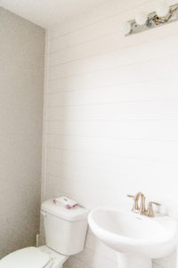
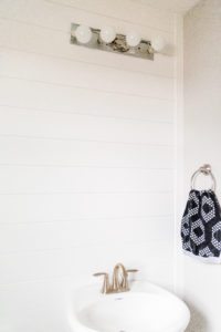
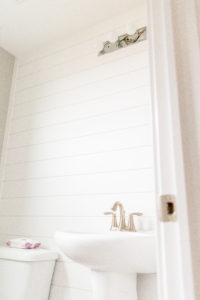
I just realized these photos were after we had started doing some upgrades! We added shiplap as an accent wall, which was completely plain before. It was just grey with a standard oval mirror. I love how shiplap looks, and it adds the right amount of pop to the small bathroom.
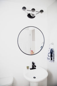
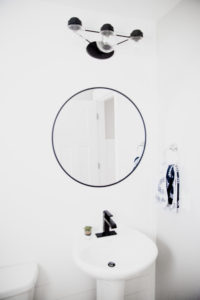
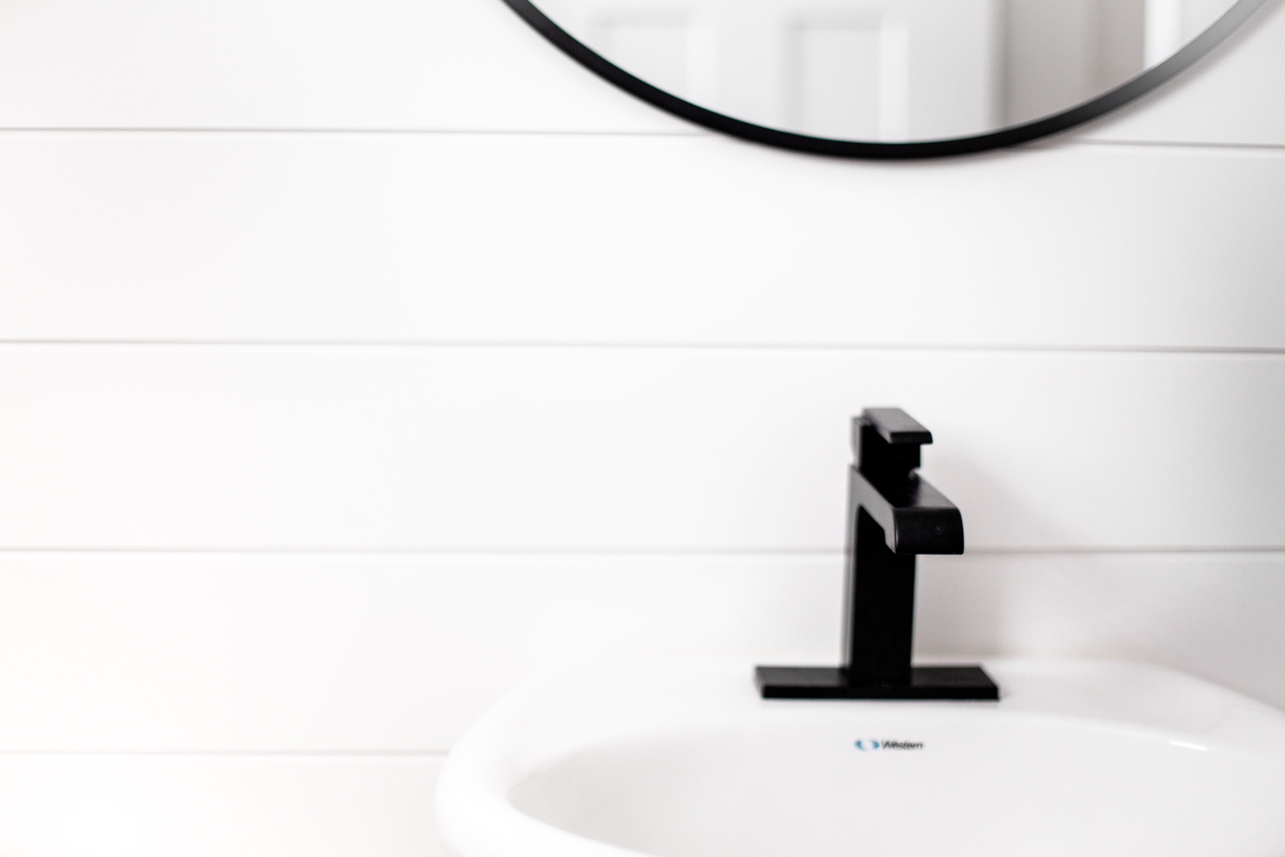
I knew the brushed nickel fixtures had to go…like yesterday. I was choosing between a black or gold finish, but I ultimately decided that black was more timeless, and if we ever decide to sell, future buyers would appreciate matte black more than gold. Build.com had a wide selection of fixtures in black, and I fell in love with matte and knew that was the right choice! Because our pedestal sink is so small, a normal soap bottle doesn’t even fit on the side. It was important to me to have a one handed temperature control, so it would free up some space on the sides of the faucet. All of that criteria lead me to THIS beautiful matte black faucet by Delta. It was just what I was looking for.
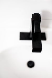
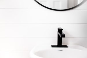
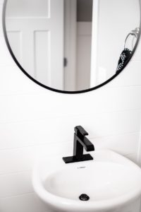
It left me with the perfect amount of space on either side, so I can actually fit a soap bottle, yay! That was my biggest concern, because it was so annoying having to drip across the floor. I love how the matte finish looks against the flat white paint of the shiplap. I found a basic circle mirror with a thin matte black border from Target, and I knew that it would match perfectly. The mirror sells out often, so keep checking back if that is the case. You can get it HERE.
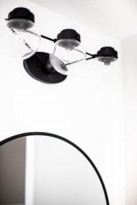
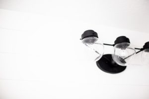
Another thing that needed to be upgraded was the light fixture. Say no to brushed nickel! Again, I wanted to stay on track with the matte black theme, and I thought I would like the globes around the light bulbs to be clear glass. I was also looking at 3 bulb options…which let me to THIS simple beauty. This fixture from Progress Lighting is also very affordable and that is hard to find sometimes! It all looks like it just came that way and I absolutely love how it all flows together.
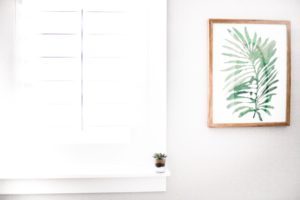
I also wanted a small piece of art to put in the empty space next to the window. I was looking for it to be neutral and calming, nothing too crazy. I found a perfect sized picture from Target (of course), and loved the light wooden frame. It is THIS watercolored palm leaf photo from their new Project 62 line. It fits perfect!
Thank you to Build.com for sponsoring this post, and for carrying an amazing selection of products. Be sure to check them out for all your home improvement needs!
xo,
Robyn
